Overview
Indeed, a platform that connects job seekers with employers, was redesigned with a focus on making the experience faster, and less prone to errors.
Time Line
3 Months
The Team
3 Designers
1 Product Manager
My Role
Comparative Studies
Usability Study
Design system
Low and Hi-fi prototype
User Persona
Problem
Users find the profile-building process inefficient.
Why is navigation of job search challenging?
How might we improve the job search experience and build a user profile that is faster, more intuitive, and reduces errors.
Impact of Redesign
We have conducted usability studies with 5 participants on Building a resume, searching for a job, and using search filters. We have sent out pre and post-surveys to measure user stratification.
71.95%
decrease in time to complete the tasks
85.57%
decrease in error rate
67%
increase in user satisfaction rating
Prototype
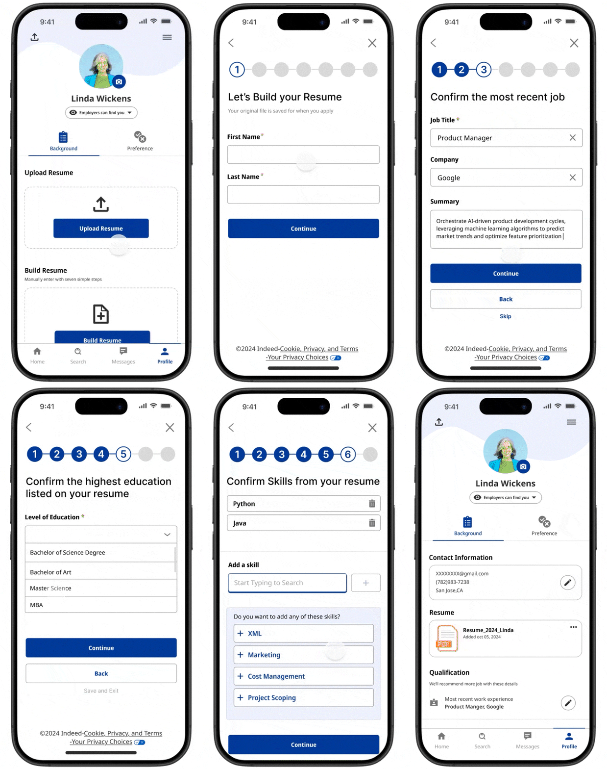
Profile Building
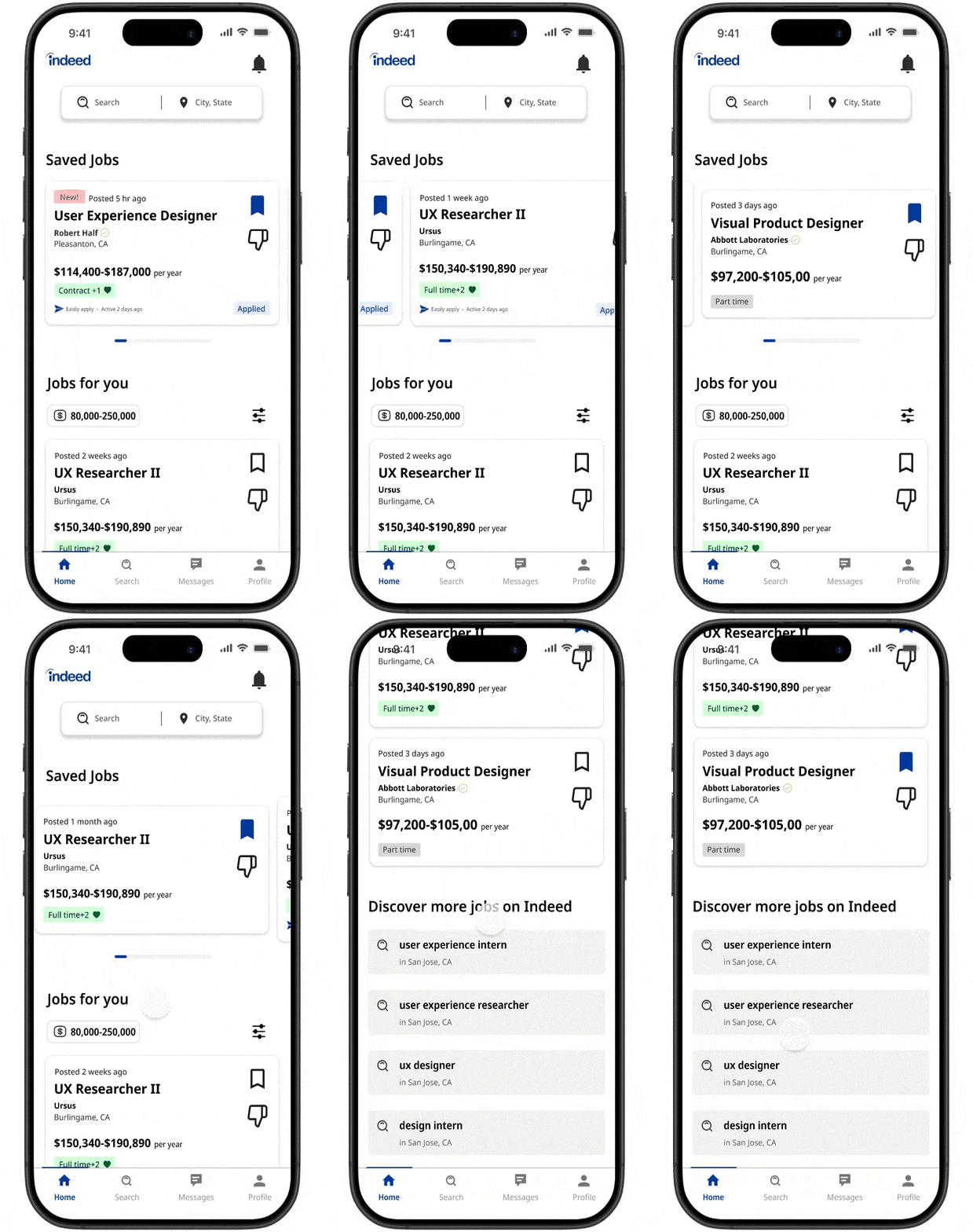
Home Page
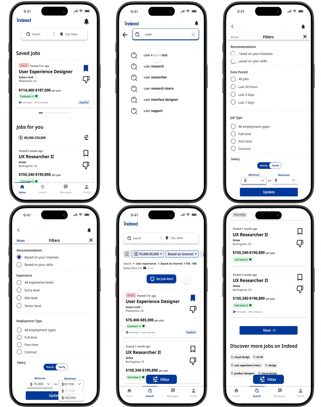
Search & Filter
Process
Interface Evaluation Comparative Study
Identify User Profile
Usability Study
Redesign
2nd Round Usability Study
Profile Building
Iteration
Show me the steps clearly, and don’t make me repeat my input.
Streamline interactions by eliminating redundant clicks and enhance user feedback
Original Design
Participants must click on each section and manually enter the content.
The qualification section is highly repetitive, requiring additional time and effort for manual entry and editing.
The profile-building section requires excessive repetitive text entry, which could be easily automated.
The progress bar lacked sufficient feedback, potentially leading to user frustration.
Navigate Job Search
Provide clear, relevant job openings that match my experience and needs
Enhance efficiency by delivering precise information and optimized job search results
Original Design
Excessive steps to access saved jobs, leading to some being forgotten and left unsubmitted.
While activity status is useful, the posting date becomes more important as the number of applicants increases
Closely placed, small icons with opposite meanings increase the risk of slip errors and accidental taps.
Search results do not match user expectations, and with no option to disable the algorithm, the increasing number of ghost postings further erodes user trust.
The job alert setting is placed too far from the search bar and filter results, disrupting the user flow
In the first round of the usability study, participants made an average of 3 errors per person.
The average task completion time is 213.64 seconds.
Redesign Iteration
✅
✅
✅
✅
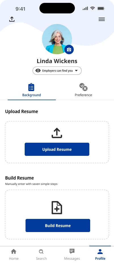
Encourage resume uploads and streamline form completion into a unified flow, minimizing the extra effort required to navigate each section separately.
Combine the qualification and resume sections to reduce redundancy and simplify the process for greater efficiency
Utilize automation and one-click functionality to eliminate unnecessary manual entry.
Label the progress with numbers to provide users with clear expectations and feedback on their progress.
In the first round of usability testing, the job search feature received the lowest user satisfaction score of 3 out of 5.
Users made an average of 2.2 errors when applying filters during their search.
Redesign Iteration
✅
✅
✅
✅
✅
Minimize clicks by making saved jobs easily accessible and placing them at the top as a reminder to apply.
Include the posting date on each job card to help applicants increase visibility while preventing job listers from receiving excessive applications.
Increase icon size and spacing to enhance usability and reduce accidental taps.
Give users the choice to enable or disable algorithmic suggestions with clear transparency. Add a verified company tag to highlight reputable employers with fewer ghost listings and higher ratings.
Reduce cognitive load by minimizing the need to remember selections; display job alerts at the top and applied filters in a breadcrumb trail for easy reference


